Active IQ Unified Manager Discussions
- Home
- :
- Active IQ and AutoSupport
- :
- Active IQ Unified Manager Discussions
- :
- netapp-harvest weird UI on Dashboard on OSX & Chrome
Active IQ Unified Manager Discussions
- Subscribe to RSS Feed
- Mark Topic as New
- Mark Topic as Read
- Float this Topic for Current User
- Bookmark
- Subscribe
- Mute
- Printer Friendly Page
- Mark as New
- Bookmark
- Subscribe
- Mute
- Subscribe to RSS Feed
- Permalink
- Report Inappropriate Content
I'm experiencing a weird UI funny, if I open up the Highlights dashboard on Chrome on OSX It seems to not render correctly I get this:
As you can see it is as though there are 2 rows of a table and the one graph is in the top right cell and the other 2 on the bottom 2 left ones. It is only the Dashboard that does this, other graphs are displayed fine.
I thought maybe it was one of my funny extensions so tried it in Incognito Mode and on another machine and all did the same. It is OK on Chrome on Windows and Safari & Firefox work fine on OSX so is just Chrome on OSX that does this - maybe is something in Chrome not Graphite itself. I reimported the Highlights dashboard from the original distribution incase I had messed up some something.
It isn't serious (and is just cosmetic) but thought I'd post and ask if you knew what could be causing it.
Solved! See The Solution
- Mark as New
- Bookmark
- Subscribe
- Mute
- Subscribe to RSS Feed
- Permalink
- Report Inappropriate Content
Hi,
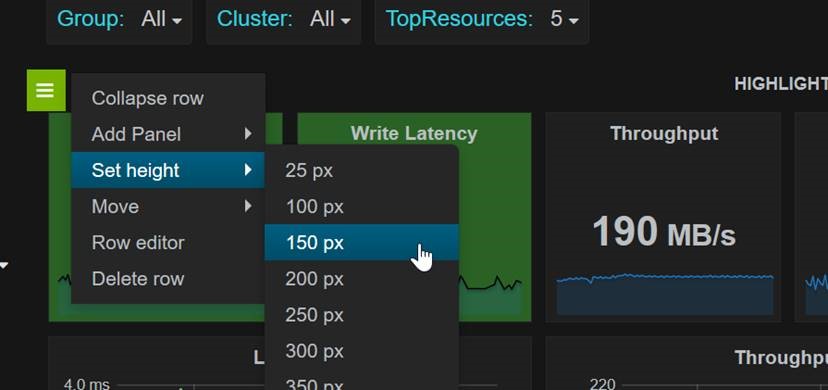
I've never seen this myself (I'm on win or linux) but someone else mentioned the same a while back and said he fixed it by setting the top row a bit bigger:
Can you try that? My guess is there is something about the use of two different pixel heights in this row that is causing an issue with a specific OS/browser.
In addition to this height setting per row shown above, you can also override for a given panel individually on the 'general' tab, height field. Put a number in there and be sure to put a px on the end (i.e. 200px and not 200). If you can find something that gives us 100px for the top row, and 250px for the graphs, and works in chrome on OSX post the resulting dashboard and I can replace it in the next Harvest release.
Last thing, the "NetApp Dashboard: Cluster Group" has the same layout. Our of curiosity does it have the same layout issue?
Cheers,
Chris Madden
Storage Architect, NetApp EMEA (and author of Harvest)
Blog: It all begins with data
- Mark as New
- Bookmark
- Subscribe
- Mute
- Subscribe to RSS Feed
- Permalink
- Report Inappropriate Content
I just connected to my one RDS server and loaded up Graphite (Chrome on Windows) and had the same UI thing with the Dashboard, so could be something to do with the resolution, I'll see if I can figure out more when I get a bit of time.
- Mark as New
- Bookmark
- Subscribe
- Mute
- Subscribe to RSS Feed
- Permalink
- Report Inappropriate Content
Hi,
I've never seen this myself (I'm on win or linux) but someone else mentioned the same a while back and said he fixed it by setting the top row a bit bigger:
Can you try that? My guess is there is something about the use of two different pixel heights in this row that is causing an issue with a specific OS/browser.
In addition to this height setting per row shown above, you can also override for a given panel individually on the 'general' tab, height field. Put a number in there and be sure to put a px on the end (i.e. 200px and not 200). If you can find something that gives us 100px for the top row, and 250px for the graphs, and works in chrome on OSX post the resulting dashboard and I can replace it in the next Harvest release.
Last thing, the "NetApp Dashboard: Cluster Group" has the same layout. Our of curiosity does it have the same layout issue?
Cheers,
Chris Madden
Storage Architect, NetApp EMEA (and author of Harvest)
Blog: It all begins with data
- Mark as New
- Bookmark
- Subscribe
- Mute
- Subscribe to RSS Feed
- Permalink
- Report Inappropriate Content
Hi Chris,
I set the height to 150px as you showed and it sorted out the layout problem. Yes, you are correct the Cluster Group did show the same.
Many thanks that makes things look a lot nicer.
I will try and see what is the best values to use when I am at my work machine tomorrow vs using the 150px general change.
I 'm really enjoying tinkering with Graphite.
Regards,
Mike


