I'll describe what I'm looking to do first:
1. I want to generate a line graph where the X-axis is time(2013-present, 1 month increment) and the Y-axis is in terabites.
2. The series/lines I want are:
a. Raw capacity
b. Allocated Aggr capacity
c. Used Aggr capacity
d. Allocated Flex Vol capacity
e. Flex Vol Used capacity
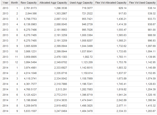
I get a-c from storage & storage pool package, and d & e from internal volume package. The list I get from the joined query looks correct. I changed the text of the headers for the aggrs(they originally show up as c8, c6, c9, so on):
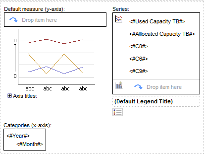
From it I try to generate a line graph and it looks like this in report studio:
And the output gives me, in the series section, values from the aggr query instead of the label:
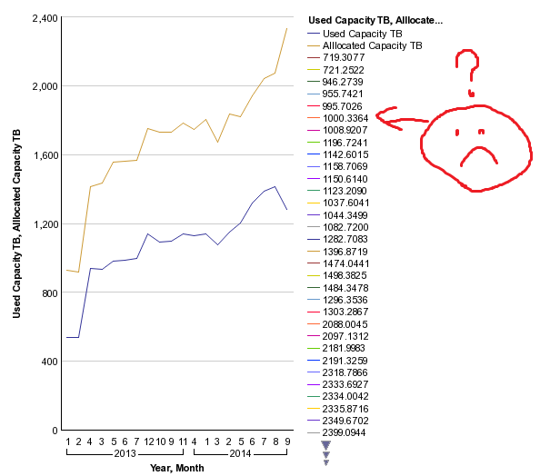
So I'm expecting 5 lines, and I get a bunch more lines;one for each aggr query value. Can someone tell me what I'm doing wrong?
Thanks,
Dew