NetApp Community Update
This site will enter Read Only mode on July 23 as we prepare to move to a new platform.
You will still be able to view content, but posting and replying will be temporarily disabled.
To learn more, please review the information in this blog post.

Active IQ Unified Manager Discussions

Unexpected graph behavior

rmatsumoto
4,580 Views

I'll describe what I'm looking to do first:

1. I want to generate a line graph where the X-axis is time(2013-present, 1 month increment) and the Y-axis is in terabites.

2. The series/lines I want are:

     a. Raw capacity

     b. Allocated Aggr capacity

     c. Used Aggr capacity

     d. Allocated Flex Vol capacity

     e. Flex Vol Used capacity

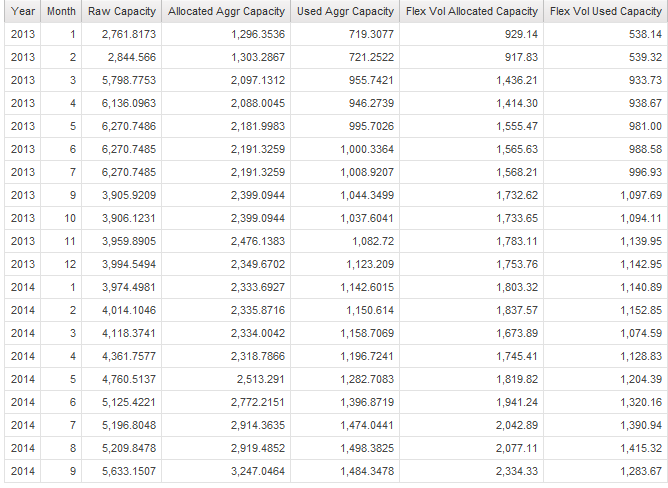
I get a-c from storage & storage pool package, and d & e from internal volume package.  The list I get from the joined query looks correct.  I changed the text of the headers for the aggrs(they originally show up as c8, c6, c9, so on):
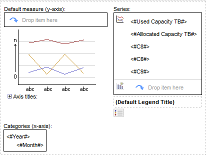
From it I try to generate a line graph and it looks like this in report studio:
And the output gives me, in the series section, values from the aggr query instead of the label:
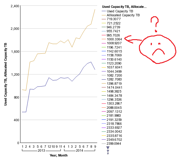
So I'm expecting 5 lines, and I get a bunch more lines;one for each aggr query value.  Can someone tell me what I'm doing wrong?

Thanks,

Dew


1 REPLY 1

rmatsumoto
4,580 Views

I should point something out about the points a through e.  When I chart it in separate instances of report studio, I do not encounter the problem.  So if I just try to chart the storage pool info in its own RP instance, it's fine.  The same for internal volumes.  I get the problem above when I try to chart it, and I also get the same problem when I try to make this report in a crosstab;  year then month for columns, then the other 5 for rows. 

Public